
As a leading provider of professional trading technology solutions for the global equities, equity options, and futures markets, Sterling’s strongest desire was to captivate their prospective clients’ attention and stand out among their competition.
Trading Up
Shortly after operating under new ownership, Chicago-based Sterling Trading Tech was tasked with rebranding to better align with their position as a leader in their space and new technology offerings. This included a new visual identity and a completely overhauled website to match. The financial technology solution provider approached Solid with two goals in mind:
- Build the website with STT’s new look and feel;
- Improve the website user experience
Meeting of the Minds
Sterling was looking for a partner to upgrade the online representation of their brand, allowing their new look to flow through the pages of their website, in order to better help every one of their website visitors, for capital market-firms. Solid Digital stepped into the collaborative and creative process, through interpretation and application, Solid Digital brought in the UX portion of the website to fulfill the Sterling’s vision and goals.
Partnering Up
While working with Sterling, Solid Digital kept each overarching goal in mind, while giving best-practice recommendations throughout the project. In order to capitalize on the company’s product lines; Trading Platforms, Order Management System and Risk and Margin. Solid Digital’s team set realistic expectations, prioritized steps, and allowed plenty of room for future website evolution. Work was done simultaneously with Sterling’s rebrand, so deadlines and project details were aligned from the start.
First, the two teams came together on the layout of the main pages, with feedback going back and forth over design elements and structure. Previously the website was loaded with information, and each Sterling product had a separate page. Solid Digital set to work on consolidating the product pages with clear and concise information about each offering, Highlighting their leading features and functionalities.
Both the Sterling and Solid teams took a dynamic approach to the project, with Sterling CMO, Melinda Joseph, taking on the role of liaison between the two, tying efforts together, and ensuring clear communication through effective organization from the project’s kick-off to launch day.

Drawing Lines
Sterling Trading Tech offers complex product offerings with difficult terminology. Sterling CMO Melinda Joseph helped provide expertise on the products and gave Solid Digital the feedback necessary to create a comprehensive, consistent website. It was also paramount to prevent the rebrand from eclipsing the user experience. Solid Digital worked alongside Sterling to create a seamless user experience, improving the web design through simplifying the content and drawing the design elements through each web page. After a few of Sterling’s branding explorations and a tight, challenging timeline, Solid helped center the brand’s representation through their website with a result that generated excitement and built approachability and ease of navigation into the online extension of the brand.
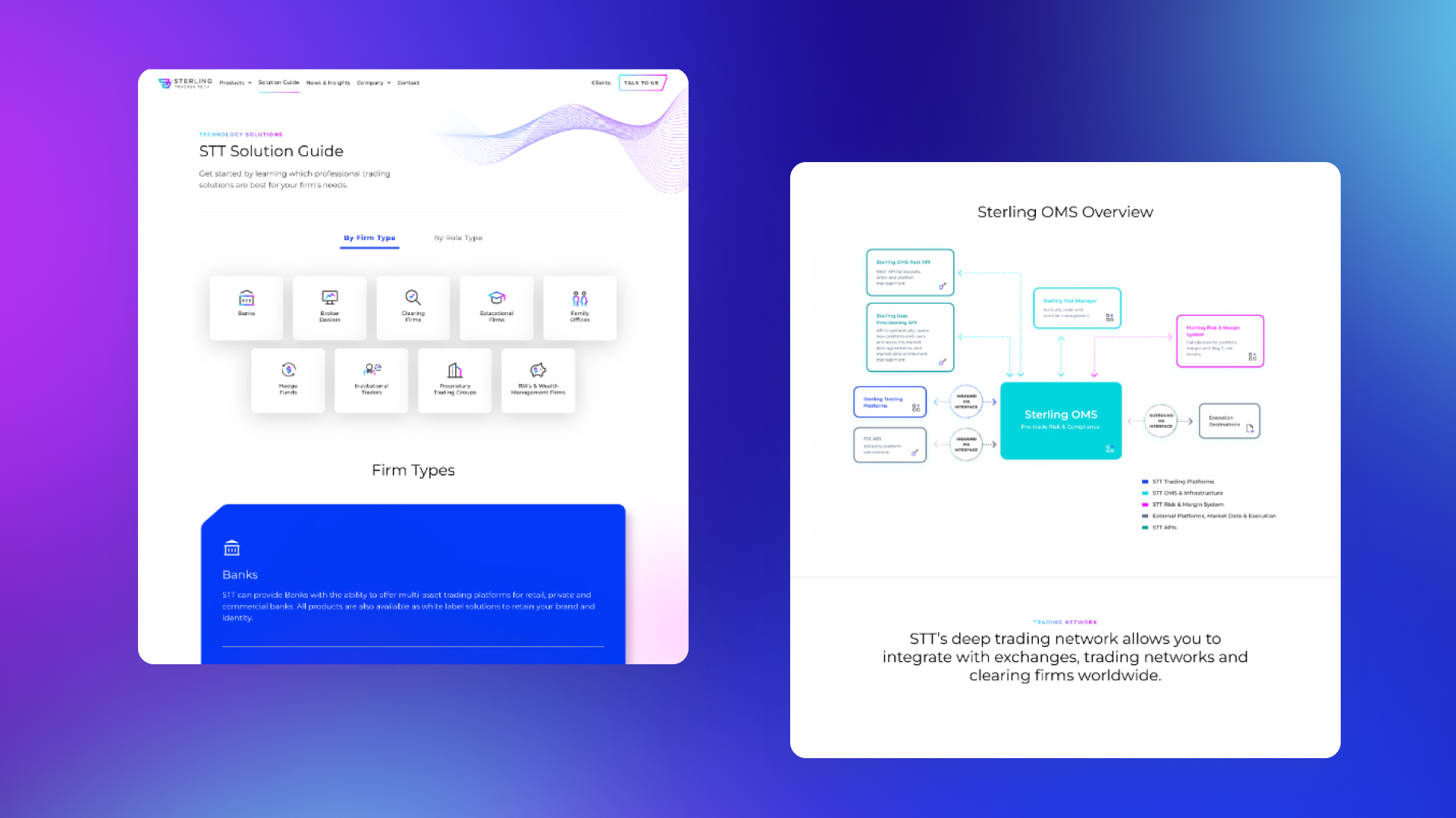
When it came to website user traffic (and resulting user pathways), Sterling’s previous website didn’t offer a clear delineation between a current buyer/user and a prospective buyer/decision-maker. To sharpen these lines, both teams were able to build out webpages to remedy this. Sterling’s team created the user-centric Client Portal for existing clients, while Solid Digital’s team completed the Solution Guide to guide prospective firms.

Modern Problems, Modern Solutions
Solid Digital was able to successfully address each of Sterling’s goals with their partnership. In order to improve the look and feel of the website, they helped Sterling leverage their new rebrand with a strategy and process that created an approachable website. Solid visually and verbally communicated the complexity of Sterling’s trading technology solutions through simplified content and consistent graphics. Solid’s hover state and animations helped bring additional excitement to the site, as well.
When it came to improving the user experience and best pathways for ideal users, Solid was able to direct current client-items (such as user guides and “Download Now” CTAs) to the Sterling-created Client Portal.
In order help prospective firms navigate through Sterling’s product offerings, Solid’s team created the STT Solution Guide. The tailored results come up after the user self-selects between firm type or role type, with a variety of sub-selections that directs them straight to the products that will work best for them. This created a more user-friendly website that didn’t overwhelm visitors with information.
Set to Double
Ultimately, Sterling’s new site offers a well-thought-out, cohesively branded website, allowing it to become a keystone of the company. With color-coded products and built-in animations inspired by modern design, Sterling is excited not only about the visual direction and overall final product, but also the timeliness of launch within an abbreviated timeline.
The Solution Guide offers a path for different audiences and adds an SEO boost, allowing Sterling to be more competitive digitally within their space, while the Client Portal helps address the glut of user-oriented technical content.
Beyond following Solid Digital’s recommendations in terms of balancing approachability and cutting-edge style, Sterling’s success can also be attributed to their collaborative spirit and communicative team, allowing the project the full attention it vitally required.


