Whether we are designing a website, a piece of software, or an application, a solid UX strategy is imperative. With that said, this past summer, we jumped on the opportunity to attend an Object-Oriented UX Workshop (OOUX) presented by Sophia Voychehovski Prater.
Object-Oriented User Experience (OOUX)
The workshop was great in presenting the concept of OOUX, not only with group exercises, but also by means of showcasing real life examples of OOUX in action. One thing stood out that I kept thinking about. Sophia quoted Valerie Jencks in saying that a websites “top navigation is the fire escape”. Basically suggesting that your navigation is only there for when you absolutely need it (hopefully, never).
I immediately mentally dismissed this idea, thinking to myself, “Oh, pish posh! I use the navigation all the time to get to where I want to go on a site.”
The top navigation is the fire escape.
– Valerie Jencks
The Realization
I then realized though, I was momentarily thinking about this through the lens of a creator. I am the one that creates the website. I put those navigation items in place and know exactly what they’re for. I use the navigation to quickly go to pages I might be working on or testing.
Thinking about it from the user’s perspective, I should not have to go to the navigation, or even worse, open a hamburger menu to find what areas that might be of interest to me.
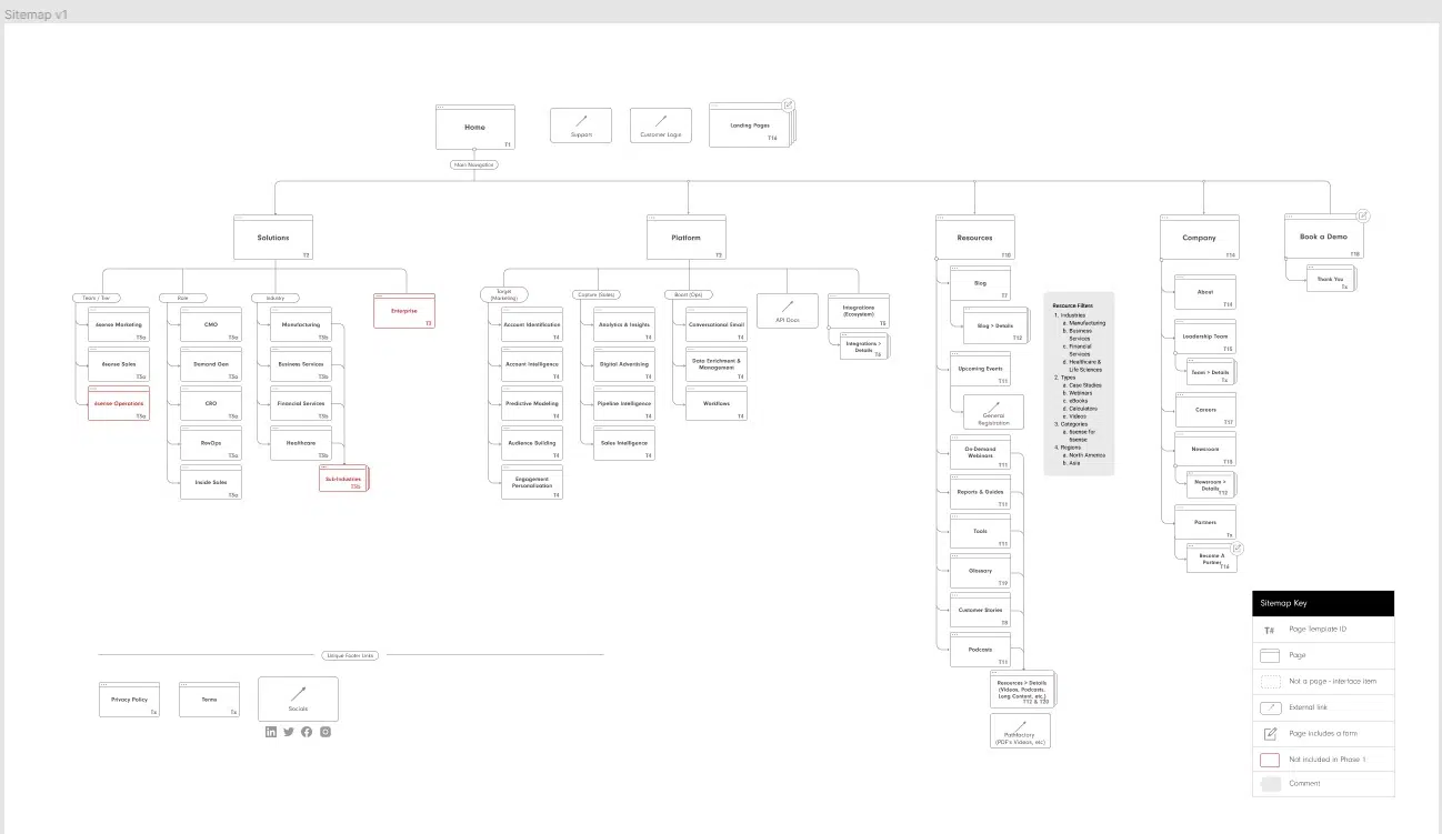
A user should easily be able to get to where they want to go just by naturally viewing each page. The content on the page is a user’s navigation. Each page should lead a user to other areas of the site that would be of interest to them. And if a user did for some reason find themselves at a dead end or not finding what they were looking for, the main navigation is there, as a last resort, for them to use as a fire escape.
Implementation
Here at Solid Digital, we had been already applying this UI/UX-oriented thinking to an extent. We always find ways to lead a user to a next step, a goal conversion, or to related content they may be interested in. We are always looking for ways to keep the user engaged.
Now, with this concept of the navigation only being there, in case of emergency, as it were, we think even more about what sort of content can live on each page and how a user can navigate the site contextually and stay engaged even if the navigation didn’t exist.
This is especially important when thinking about the mobile experience, where users are trying to quickly get information they need in a more slimmed down experience.
We now try to think of the top navigation as “for emergency use only.”


